DigiPak and Poster:
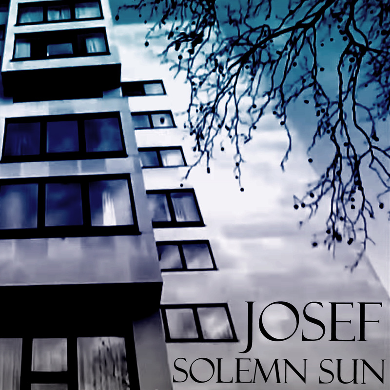
The front and back cover are somewhat effective however, the inside covers could have been considered further and been sharper and clearer in tone and design.
The dark colours used reflects the nature of the music and then band but isn't all that eye catching in a professional environment, so when the CD is placed upon a music store shelf it isn't all that likely to grab the attention of those walking past however, for on-line use it is ok as when an audience member views the cover, they would have most likely already searched the bands name as most people now a days tend to know before hand what it is that they are looking for before the look for it.
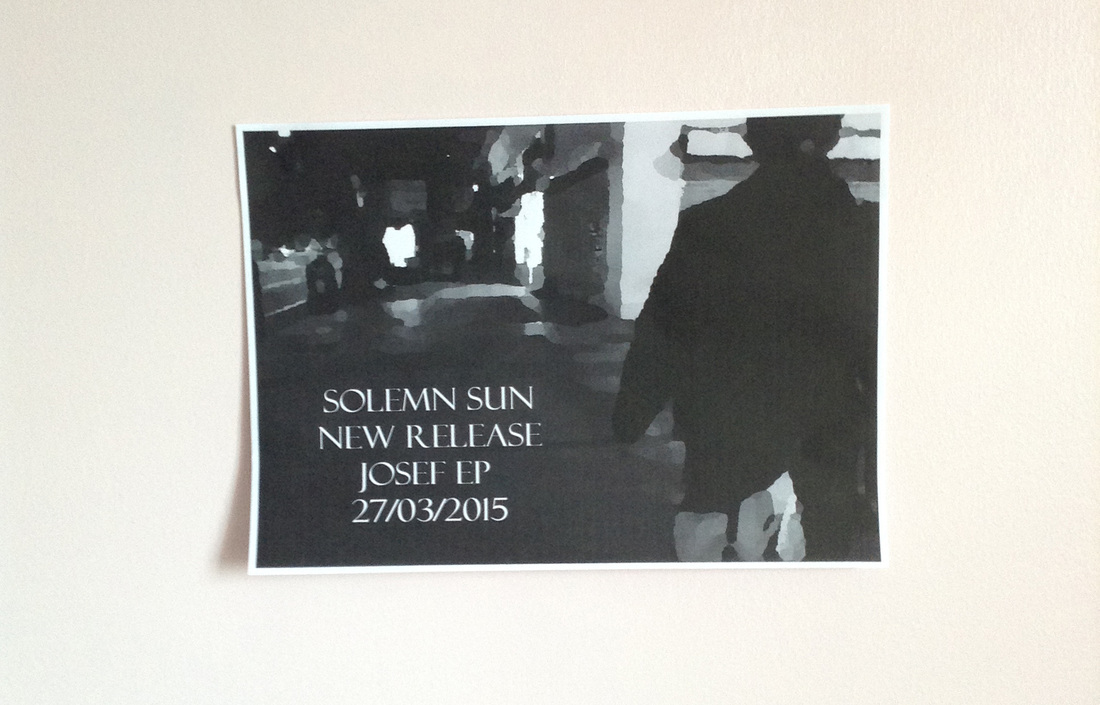
The poster is too dark and even though it reflects the nature of the music, it doesn't fulfil the purpose of an advertisement piece as it fails to capture the viewers attention. Even if it were to be blown up to an A1+ sized advertisement billboard, the bleak nature of it means that it is unlikely to gain a new demographic of audience. Both the poster and digipak feature freeze frames from the video thus, the three tasks have become very interlinked.
Music Video:
The music video itself features some conventional and stereotypical features of the genre yet there are some parts which may be considered as ineffective for the purpose of genre and audience such as the continual building shots. The reason that I included multiple building shots was in order to create a feeling of insignificance of nature and humans compared to our creations of these concrete giants. The idea was to make the audience feel 'small' in amongst a city, a place that we as mankind have created but have lost control over and now all that we do is overlooked by the city in all its regal-ness. We are being over powered by giant corporations as a unit and individuals are being over powered by addiction to the such like of alcohol as featured in my video. The main idea being that no matter what we do, nature will always fight back.
Looking at the front cover of my digipak, the building is accompanied by the inclusion of trees and foliage, thus reflecting the main idea of my video being that no matter how much we build and live our lives ruled by our vices and needs, nature will always fight back and find a way to appear, much like weeds in the cracks of the pavements.
The combination of both ancillary texts and main product has strengths along with weaknesses, the ancillary texts reflects the bleak nature of the song and the dark tones of the band and music video I produced so as a trio there can be clear links made between each piece of work. As the main message I wished to portrayed can be seen (with some analysis) throughout all three pieces of work there is a strong link and all three tasks work in tandem. However, looking at each task individually, there are some points of weakness where the target brief of the piece, such as an eye catching advertisement, are not met, meaning that they do not fulfil their purpose.
The front and back cover are somewhat effective however, the inside covers could have been considered further and been sharper and clearer in tone and design.
The dark colours used reflects the nature of the music and then band but isn't all that eye catching in a professional environment, so when the CD is placed upon a music store shelf it isn't all that likely to grab the attention of those walking past however, for on-line use it is ok as when an audience member views the cover, they would have most likely already searched the bands name as most people now a days tend to know before hand what it is that they are looking for before the look for it.
The poster is too dark and even though it reflects the nature of the music, it doesn't fulfil the purpose of an advertisement piece as it fails to capture the viewers attention. Even if it were to be blown up to an A1+ sized advertisement billboard, the bleak nature of it means that it is unlikely to gain a new demographic of audience. Both the poster and digipak feature freeze frames from the video thus, the three tasks have become very interlinked.
Music Video:
The music video itself features some conventional and stereotypical features of the genre yet there are some parts which may be considered as ineffective for the purpose of genre and audience such as the continual building shots. The reason that I included multiple building shots was in order to create a feeling of insignificance of nature and humans compared to our creations of these concrete giants. The idea was to make the audience feel 'small' in amongst a city, a place that we as mankind have created but have lost control over and now all that we do is overlooked by the city in all its regal-ness. We are being over powered by giant corporations as a unit and individuals are being over powered by addiction to the such like of alcohol as featured in my video. The main idea being that no matter what we do, nature will always fight back.
Looking at the front cover of my digipak, the building is accompanied by the inclusion of trees and foliage, thus reflecting the main idea of my video being that no matter how much we build and live our lives ruled by our vices and needs, nature will always fight back and find a way to appear, much like weeds in the cracks of the pavements.
The combination of both ancillary texts and main product has strengths along with weaknesses, the ancillary texts reflects the bleak nature of the song and the dark tones of the band and music video I produced so as a trio there can be clear links made between each piece of work. As the main message I wished to portrayed can be seen (with some analysis) throughout all three pieces of work there is a strong link and all three tasks work in tandem. However, looking at each task individually, there are some points of weakness where the target brief of the piece, such as an eye catching advertisement, are not met, meaning that they do not fulfil their purpose.
Front Cover
Poster
